Learn how to swap X and Y axis in Excel with this step-by-step guide. Fix chart mishaps easily and perfect your data visuals today.
Have you ever made a chart in Excel and realized the X and Y axes got flipped? Maybe you were trying to measure productivity with a scatter plot, and Excel ended up putting the categories on the wrong axis. It’s so frustrating, right? I’ve been there! You spend all this time setting up your data, and then Excel just messes it up. But don’t worry, I’ll show you a few easy fixes to swap the X and Y axes. By the end of this, you’ll be handling chart hiccups like a pro.
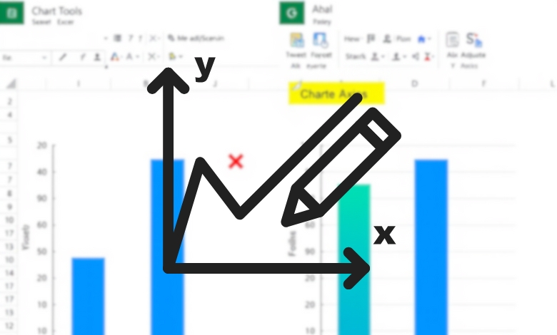
Article Breakdown
Why Swapping Axes in Excel Matters
Before we get into how to fix this issue, let’s talk about why it’s important. Getting the X and Y axes right is critical for making your data easy to understand. Imagine you’re presenting sales data over time, but Excel puts the years on the Y-axis instead of the X-axis. That would confuse your audience, and your chart wouldn’t make any sense. Whether you’re looking at financial trends, scientific results, or customer behaviors, displaying your data the right way is key to making smart, informed decisions.
The Simplest Method: Using the ‘Switch Row/Column’ Option
If you’re lucky, the easiest way will do the trick. Excel has a built-in tool that lets you swap data between rows and columns, and sometimes that’s all you need to switch the X and Y axes.
Steps to Use ‘Switch Row/Column’:
- Select Your Chart: Click the chart to highlight it.
- Open the Data Options: Right-click on the chart and choose “Select Data” from the menu.
- Switch Rows and Columns: In the window that appears, look for the “Switch Row/Column” button and click it.
- Check and Save: Hit “OK” and confirm that the axes look right.
When This Works (And When It Doesn’t)
This method works well for bar charts, column charts, and line charts where Excel automatically assigns categories. However, if you’re dealing with scatter plots or certain other chart types, this won’t work. In those cases, you’ll need a manual approach.
Manually Editing Series Data for Precise Control
If the quick fix didn’t work, don’t worry, you’re still in control. Let’s manually edit the data series to swap the X and Y values.
Steps to Manually Swap X and Y Values:
- Select Your Chart: Click on the chart to bring up the formatting options.
- Open the ‘Select Data’ Window: Right-click and choose “Select Data.”
- Edit the Data Series:
- In the “Legend Entries (Series)” section, click on the data series you want to edit.
- Click the “Edit” button.
- Swap the X and Y Values:
- In the “Edit Series” dialog, locate the “Series X values” and “Series Y values” fields.
- Switch the ranges in these fields by manually selecting the correct column or row from your spreadsheet.
- Click OK: Repeat for additional series if needed and check your chart.
Why This Method is More Reliable
Unlike the “Switch Row/Column” method, this approach gives you direct control over which data is assigned to each axis. It works for scatter plots, line charts, and any situation where Excel doesn’t automatically make the switch for you.
Advanced: Using VBA to Automate Axis Swapping
If you deal with complex datasets regularly, manually editing each series can be time-consuming. That’s where VBA (Visual Basic for Applications) comes in. With a simple macro, you can automate the process of swapping axes in multiple charts.
Steps to Automate Axis Swapping Using VBA:
- Open the VBA Editor:
- Press ALT + F11 to open the VBA editor.
- Insert a New Module:
- In the editor, go to Insert > Module.
- Copy and Paste the VBA Code:
Sub SwapXY()

    Dim srs As Series

    For Each srs In ActiveChart.SeriesCollection

        Dim temp As String

        temp = srs.XValues

        srs.XValues = srs.Values

        srs.Values = temp

    Next srs

End Sub- Run the Macro:
- Close the VBA editor.
- Select your chart and press ALT + F8, choose “SwapXY,” then click “Run.”
When to Use VBA
If you frequently swap axes for multiple charts or work with large datasets, VBA can save you hours of manual work. If you’re just doing this once, it’s probably not worth the hassle, but for power users, this trick is a game-changer.
Bonus Tips for Perfect Charts
1. Choose the Right Chart Type
Not all charts interpret axes the same way. Bar charts, for example, treat categories differently than scatter plots. If swapping axes doesn’t give you the expected result, consider changing the chart type.
2. Ensure Your Data is Structured Correctly
Before creating a chart, organize your data so the intended X-axis values are in the first column. This can help Excel interpret your data correctly from the start, saving you a headache later.
3. Double-Check Your Labels
After swapping axes, make sure your chart titles and axis labels still make sense. A mislabeled chart can be just as confusing as one with the wrong axes.
Finding the Right Approach for You…
If you’ve ever wrestled with Excel charts, you know that small formatting quirks can make a huge difference in how your data is interpreted. The good news? Swapping the X and Y axes doesn’t have to be a struggle.
- For simple charts, try the “Switch Row/Column” method.
- For more complex charts, manually edit the data series.
- If you need automation, use VBA to make your life easier.
Useful Articles:
- Excel VBA – Complete Tutorial: A comprehensive guide for beginners to learn Excel VBA, covering 16 chapters with examples and step-by-step instructions.
- Getting started with VBA in Office: Official Microsoft documentation to help you get started with VBA programming, including foundational concepts and examples.
- Excel VBA Tutorial: The Absolute Basics: A beginner-friendly tutorial that explains how to write VBA code, with practical examples and tips.
- 40 Excel Tips for Becoming a Spreadsheet Pro: A collection of 40 tips and tricks to help you master Excel and improve your productivity.
- 30 Awesome Excel Tips and Tricks: A curated list of 30 tips to streamline your workflow and maximize efficiency in Excel.